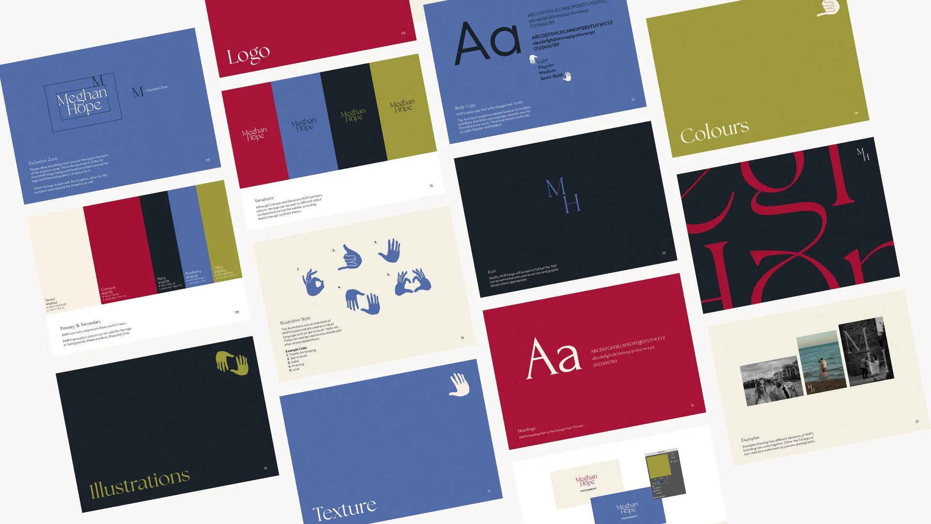
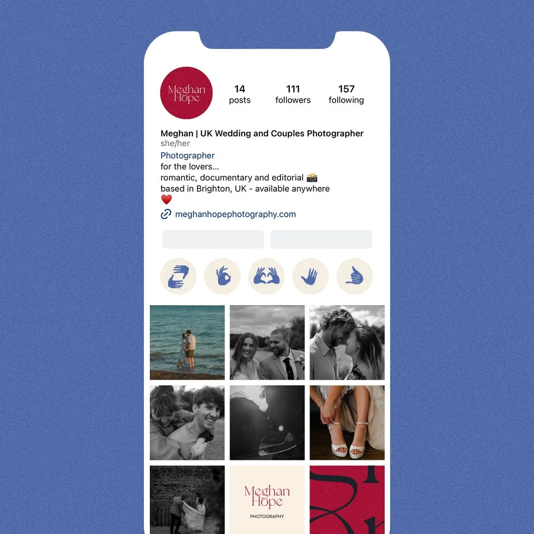
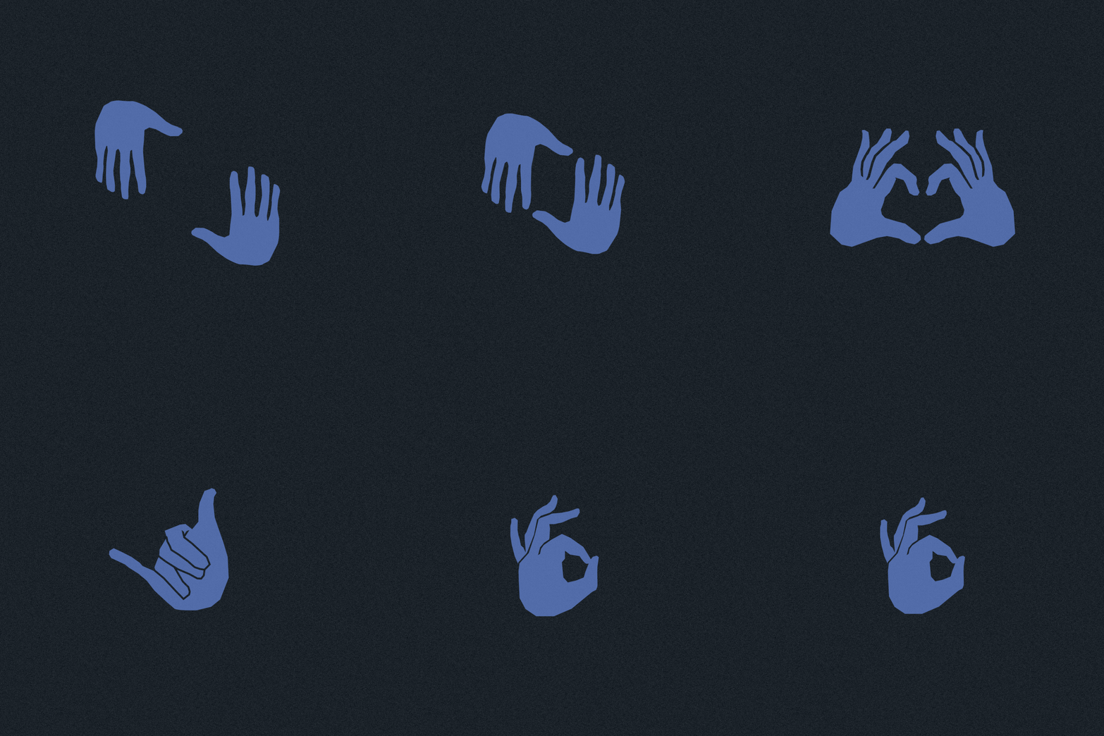
Meg reached out to me as she was keen to get her new Wedding Photography business branded and launched. She was after something romantic, timeless and with just a touch of vintage flair to fit with her style of romantic documentary photography. I connected the ‘g’ and ‘o’ of the logo to reflect the union of a marriage, also symbolic of a wedding band. From this I also developed the colour palette, a teaser and reveal logo animation and also a visual language using illustrated hands to represent different cues such as ‘get in touch’, ‘love’, ‘framing’ etc. These were created by the talented Kat Valtova.
Check out Meg’s beautiful work here: meghanhopephotography.com


