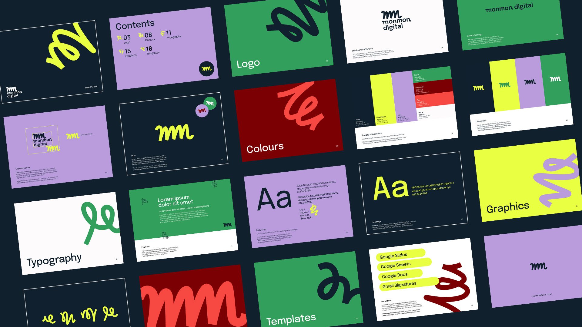

Monmon digital got in touch asking for some help giving their agency brand a lift, alongside this they were keen for a series of templates to work from. Monika mentioned being keen to attract more work from clients in the outdoor space, and so we used the peaks of the double ‘m’ to give an abstract, modern nod to journeys and mountains.
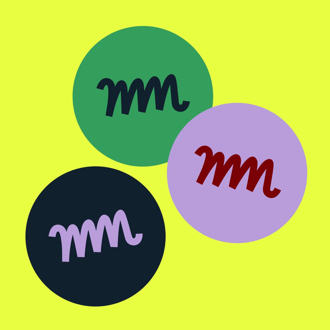
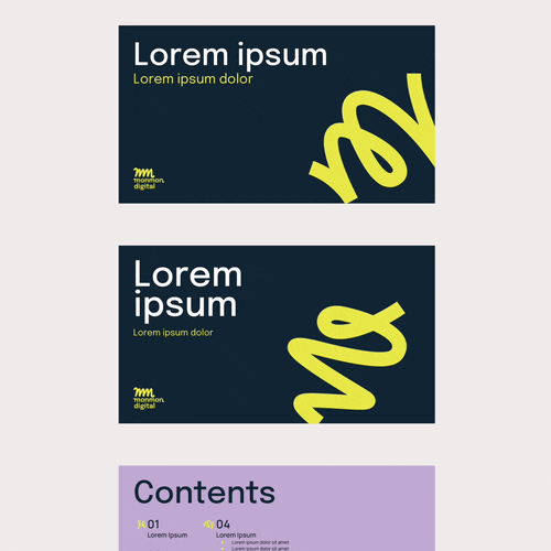
I also created a suite of shapes that resemble ‘m’s, to use as part of the graphic language elsewhere in the brand. Bringing energy and variation to title slides / designs where imagery isn’t used. Monika received LinkedIn / Instagram roundels and banners and easy-to-use Google Slides, Sheets, and Docs templates to work from in order to keep their new brand consistent when sharing documents with clients.
Check out more at monmondigital.co.uk once the site goes live!