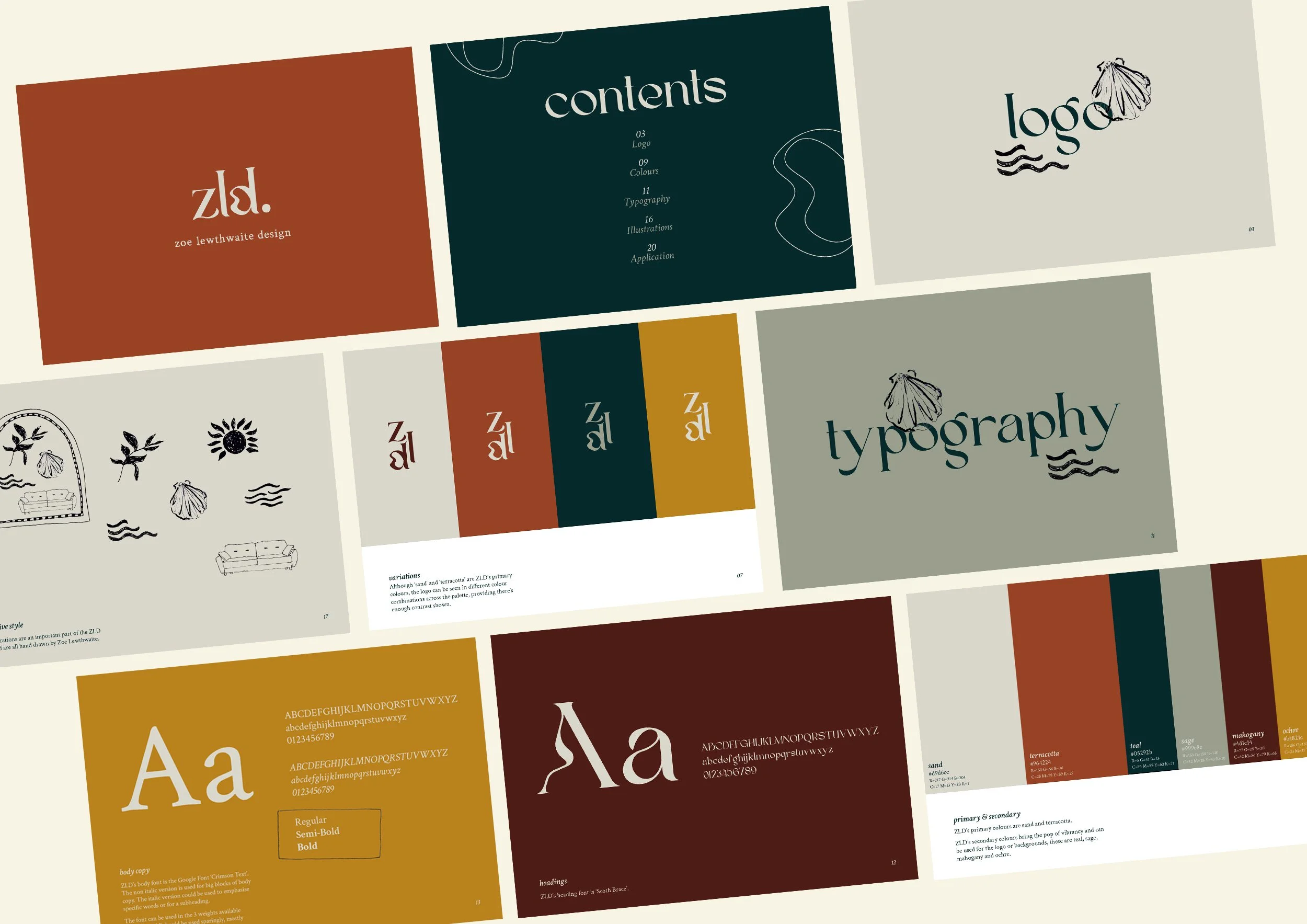
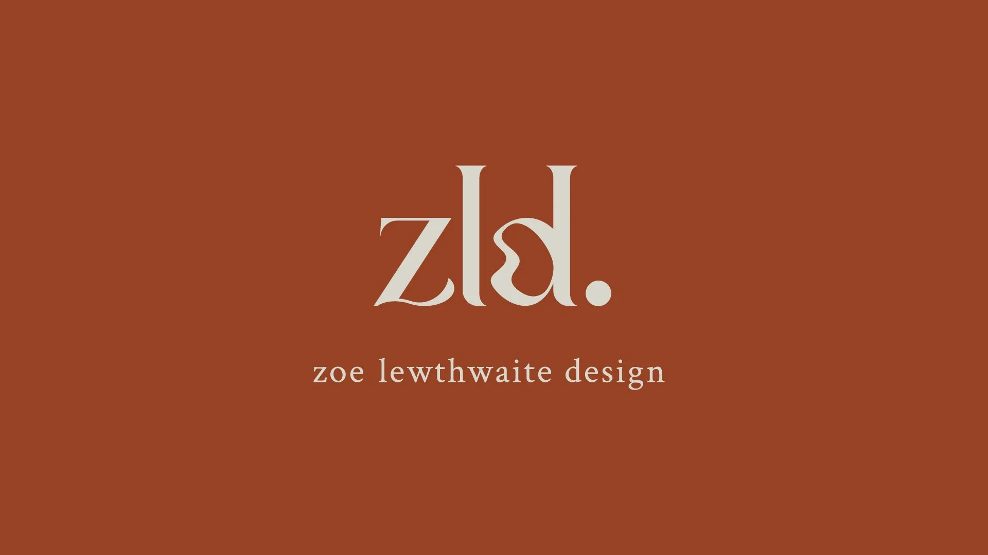
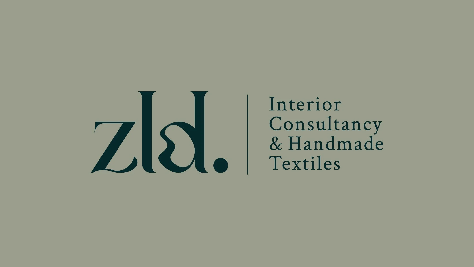
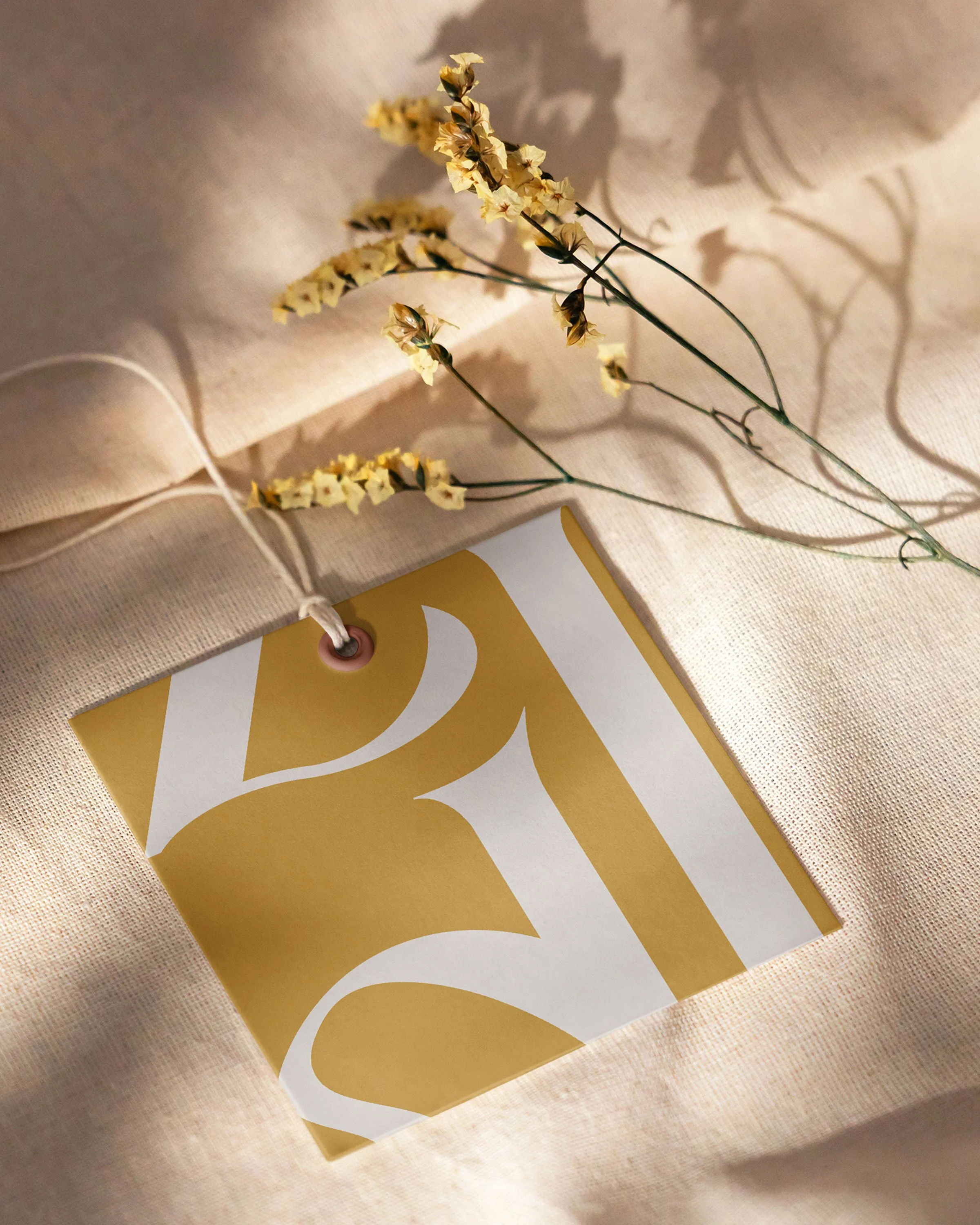
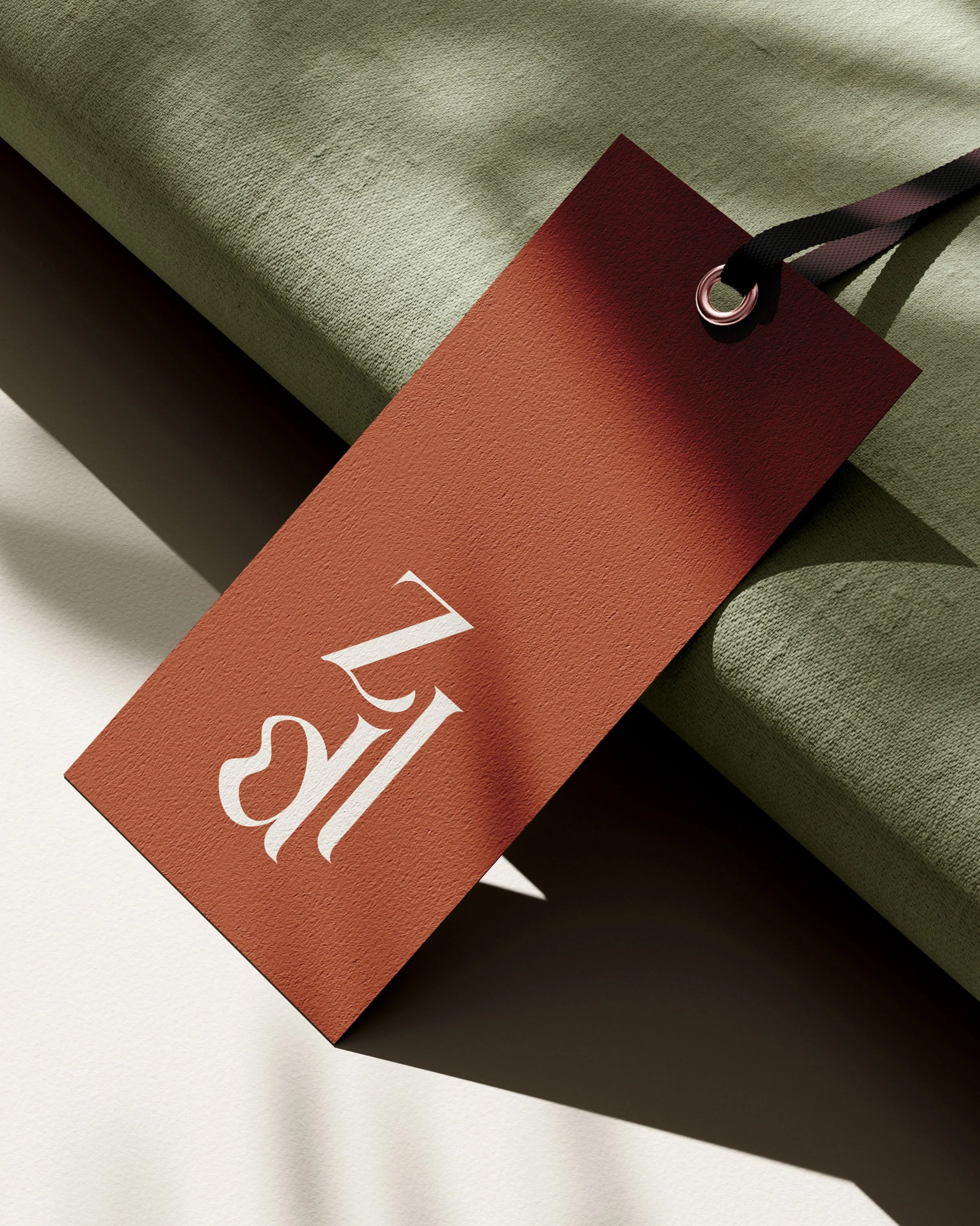
Zoe Lewthwaite Design approached me as they needed help with their logo and extension of the brand. They were after something sophisticated, stylish and timeless. We created the logo mark using a serif font with an added wave applied to the shape of the ‘d’. The wave element gives a nod to both the sea that Zoe’s studio is next to, as well as being representative of wood grain and furniture when outlined, a nod to the Interior Design Practice at the studio. We used earthy tones to create a warm and inviting identity which can be seen horizontally or stacked on labels for any materials created at the studio.

